


Ringhilwen’s Tips For Making eCards

Making eCards is a great way to contribute to The Council of Elrond. Members and non-members alike send out many eCards every day, and a ton on holidays, so submissions to the area are more than appreciated! However, there are several reasons why your submitted cards may not be accepted, and the purpose of this guide is to illustrate several things you can do to make sure your cards are accepted.
First, let’s go over some very important do’s and don’ts.
DO:
- Make sure you’re using the highest quality images you can. Starting off with images of poor quality will only make the cards look worse in the end.
- Take the time to spell check your eCard before submitting it. Nothing’s more frustrating that having a card not be accepted because of a grammatical or spelling mistake that could have been avoided.
- Always make sure to add the “Middle-earth greetings from www.councilofelrond.com” line to your cards in some way, shape, or form. Any card without this line will automatically not be accepted.
- Be creative!
- Add text to your cards! This is a big part of creativity. Blank eCards can only go so far, so add movie quotes, inspirational or holiday quotes. You can add bits of poems, books, sayings…anything that makes the card fit better into the category to which you are submitting it.
- Try new things with your cards.
- Choose text colors that match with your image and that will be readable once the card is finished.
DON’T:
- Don’t simply copy the cards that are already in the eCard section. There are infinite ways to create eCards, and making them look identical to ones already submitted is a quick way to not have them accepted.
- Expect to make perfect eCards on the first try. Practice makes perfect, and learning all the tricks and techniques of your graphics programs is the best way to become a great card maker!
- Don’t simply make the same type of card over and over again.
I. Image Quality
The key to making a good card is to start off with great images. Obviously, the CoE Gallery is a great resource for good images, but there are many other LOTR image sites where you can expand your image collection.
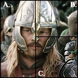 |
There are a couple things to look for when choosing an image to work with. This image of Eomer shows several problems that are often seen in submitted cards. The area marked B. is far too blurry to use. The edges of people and objects in the image are fuzzy, and it probably would not make a good card, especially if you tried to enlarge this already blurry image. The area marked C., on the other hand, is too grainy to be used. It almost looks scratchy and some of the pixels stand out far too much. This type of grainy image also occurs when an image is sharpened too much. The area marked A. shows a good image. The image is clear and not overly-pixelated, and would make a good base for starting your card. |
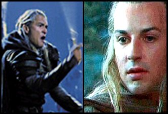 |
One of the biggest problems observed with submitted cards has to do with image quality. eCard makers will take an image too small for a card and enlarge it. However, this usually ends up distorting the image – reducing the quality. The images to the left of Haldir and Legolas have been enlarged. In the case of the Legolas image, the original picture was only enlarged by about 25%, yet it’s become blurry. Not a good image to start with for a card. The Haldir image was enlarged about 50% and has become quite pixelated rather than being a nice, smooth image. Both images are poor choices to use as cards when enlarged. Enlarging any image will only serve to highlight the imperfections in it already, which may have been less noticeable at smaller dimensions. Don’t think you have to make your eCards the maximum size specified on the submission page. Cards can be smaller than the maximum dimensions. |
II. Adding Text
Since all eCards, at the very least, have to have the “Middle-earth greetings from www.councilofelrond.com” line on them, text quality is very important. There are a few general rules you should keep in mind when adding your text, and these can be mostly illustrated with the following two images.

Both eCards have the same text, but the image on the left is an example of bad text additions, while the image on the right is an example of good text adding techniques. The following things are very important to consider when adding text to your cards.
Color: It’s always best to use a color *from* the image itself rather than choose a color arbitrarily. The image on the left has a light yellow text, which doesn’t match the card at all. It ends up making the card look poorly and quickly made. On the other hand, the image on the right uses a color from the rock walls behind Legolas for its text. This serves to make the text fit much better with the image, and shows than an effort was made to make a visually appealing card.
Font: Fonts are a great way to add decoration to an eCard and to personalize it even more. The image on the left uses a plain, boring, serif font (such as Times New Roman or Georgia) for its text. Fonts should “fit” with the image just as much as the text color needs to. The image on the right uses two different fonts to show how a more unique font can make the card more attractive. Different fonts convey different emotions and attitudes, so it’s a great idea to try several different fonts on a card in order to find the perfect match. CoE’s Font section has some great Tolkien-inspired fonts that always work well with most eCards you’d want to make!
Positioning: The positioning of text on the card can make a huge difference as to the overall look of the card. The card on the left has all of its text positioned at the left border of the image. This creates an “empty” black space to the right of the bottom portion, making the card look unbalanced. In contrast, the right card centers its text, creating a balanced layout and improving the look of the card. It’s safe to say that ‘when in doubt, center your text!’
Anti-Alias: This is not illustrated in the above card examples, but is important nonetheless. Most image/graphics programs have an option when you add text called “Anti-Alias”. When this option is NOT selected, the text does not curve smoothly, creating an extremely scratchy and unattractive look. If you’re using a font with ONLY straight lines, it’s alright not to have the Anti-Alias option selected (this applies to bitmap fonts, Tahoma, and Arial especially). With pretty much ALL other fonts, it’s a very good idea to have the Anti-Alias option selected so that your fonts look nice and smooth.
III. Adding Image Extras
Most image programs allow you to add image effects to your cards. Things like brushes, gradients, textures, lighting effects, layering, etc. all serve to enhance the look of your image and further “personalize” the card to the specific category you want to submit it to.
 |
This image of Faramir shows several image effects combined in the top half of the card, while the bottom half shows what the original image looked like. First, there is a slight texture effect called “dithering”. Second, I used one of the many lighting effects available to lighten the image (you can see how the top half is brighter than the bottom), giving a more dramatic effect. I then used a couple brushes available for use in programs such as Adobe Photoshop and Jasc Paint Shop Pro. While using brushes is definitely not appropriate for use on all cards, they can serve to further customize an eCard depending on the category. Next, I took advantage of “layers” so that the text would not appear to be written in one color, but rather seem to change colors depending on the image behind it. This was achieved by creating a new image layer for the text, and setting that layer to either a different opacity or a different overlapping style. Finally, I added a border around the image using a prominent color present in the card itself.
This guide is not meant to be a tutorial on using these features of your graphics program, since each is different. The best way to learn to use these effects is to play around with your own program, just to see what everything does. Additionally, there are some great image program tutorials available online, and those can be found using any search engine.  |