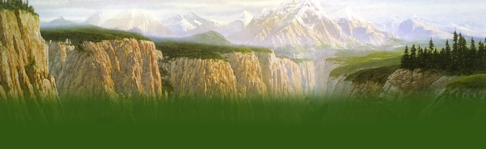
mmmmmm am I glad Tolkien didn’t make that movie himself
me too!It looks too light for something in mordor
yes… that’s what i thought, too…
I agree with Frodolover#1!!
As do I. It sorta reminds me of Gondor.
I agree Enelya Telcontar, this really does look like something you’d see in the White City. But,it’s got to…
… be Mordor, you can see Mt. Doom in the background
Are you guys kidding? That’s the cover for the old copies of ROTK! I never knew Tolkien drew it himself!
I guess he went agasint the sterotypical darkness=evil..
10 for effort! 😀
cool. i didn´t noticed mt doom
It should be..more pointy, and firey. Although it seems pointless and stupid to criticize Tolkien’s vision, of
course
Two brick walls as the fortress of Sauron? I like PJ’s better
Maybe he drew it that light to show the details better?
The picture is amazing but I do agree with everyone that the movie portrays it better.
A+ for effort and accomplishments in life; D for Barad-Dur drawing. Barad-dur means “Dark tower”!
The painting is good, but it’s really too light for mordor..
The Lord of the Legos….:)
It is really light and too structured and controlled. This was a good drawing though. Great. Just move MT doom
and call it Gondor!
The first time I saw it on my friend’s book cover, I thought it was Minas Tirith.
You couldn’t see the bridge or the drop-off.
Nice looking rocks and brick. Good job there, Mr. Tolkien! B+
it doesnt look menacing enough…looks kind of happy
I agree with RainBow…it’s too light. But besides that it’s pretty good.
I think it should look more like orcs made it. But then again… Tolkien wrote the books, so he should know..
…what things should look like.
cut off the bridge at the bottom of d picture and it looks almost like the great wall of china
My copy of ROTK has this as the cover picture
I don’t think it’s too light for Mordor at all… it’s lifeless, which is quite menacing. tres bon
Hey, ‘dark tower’ doen’t necessarilly mean phyisically black…but yeah…not quite as dark as you’d expect
from the descriptons…
when I thought of Baradur,I thought it more fantastical,tolkien’s drawing looks more down to earth
Darken it up a bit. . . yup just right. . voila!
i don’t get what you guys are arguing about… Tolkien wrote the book describing this, if it was darker you…
wouldn’t see all that detail.
he is contradicting himself in drawing the “dark tower” in light tones and colors
but i definitally agree w/ enelya sheildmaden it seems kinda weird to be critisizing tolkien’s views of a
world he created.
I agree with fearil that it looks a bit more down to earth. Also, I think that Tolkien thought of evil as
corrupted good, and so this would sort of fit with that. I guess Tolkien didn’t go in for the normal ‘good is
light and evil is dark’ thing.
hmm it is just to grey
Alot of Tolkien’s “evil” was representing industry. This looks alot like a factory to me.
That’s what I was going to say… it’s a vision of the kind of ugliness he really hated, and I guess to some..
extent it’s just using the kind of ideas he was surrounded by.
it DOES look like something that would be in Gondor. AHEM, TOLKIEN! DAAARRK tower.
why should darkness always be seen in his physical shape? I think you are being guided by the films too much.
Very nice
Well…come on people…this is how Tolkien pictured it…I guess PJ didn’t (I’m sorta glad he didn’t)
Go Radagast the brown! That’s what I would have said. I also agree with Nienna ArFeiniel; it does look like…
… a factory.
This is only a very small part of the tower. It sure would look iumpressive in its full height in the dark…
…with red glowing windows.
this is great fun, dont you think!
I think , maybe, that Tolkein didn’t intend the tower to Look evil, just to Be evil…
In other words, I wouldn’t want to go in there…
It looks smokey and hazey and poluted. I wouldn’t want to go there either. Though I admit I did picture…
…Mordor as dark *before* I saw the movies.
Tolkien didn’t know how to make dark pics; so give him some slack. Beautiful!
Course he knew how to make dark pix! He created a world, didn’t he? Barad Dur when it was new… ~Enelya
My Dad has this pic on his old old copy of ROTK.
i have the old version of RotK and this is the pic on the front. i was never sure exactly what it was supposed
to be, but now i know hehe. yea i agree with everyone it should be DARK and SCARY this just looks dim and old
Wow, that’s like the cover of my RotK book…but thecover fell off a few months ago 🙁
Think about it, guys–would Sauron waste time inventing black concrete just to make his tower look evil? You
can see he started out using black rock-the foundations were made with the power of the ring anyway-but then
he ran out and just used whatever greyish rock he had lying around! He didn’t make the mts or their color.
this is my fave tolkien pic. to all of u, it is a LOT darker in the actual version. i love how the windows
and doors are glowing red, and even the mortar for the bricks is red too. u can just feel tolkiens hatred for
industry and pollution…even the reek and smoke coming up from mount doom symbolizes it
actualy it reminds me of a building in babylon or something.. i think that the one in the movie is much better
but that is a tower created for an people to see on the screen. this is tolkiens vision, at a moment that movi
movies weren’t that spectacular as now. but it isnt that bad. just a bit bright for a’dark tower’
when i first saw the pic i thought it looked kinda prety. but prey in Mordor, no way
All I say is: Evil comes in many forms.
Wow, I always pictured Bara-Dur being made from black iron, not light stone. The sky is also quite light.
No offense, but Barad-dur looks like a chinese resturant . . .
He probably did it light just to show the detail of the landscape. Besides, dark or light I still think it is
amazingly gorgeous.
I think it’s amazing. And I think it`s better than the movie version.
So THAT’S what it is. It’s on an old copy of the Return of the King my mom has. I thought it was Minas Tirith.
(cont.) boy was I wrong.
I don’t know about you, but I wouldn’t want to walk through that door…
I cant’t refrein: “black, …, mountain of iron, gate of steel, tower of ADAMANT”, but darkness inside !
Tolkins great and all that but PJ’s Barad-dur sort’a wins.
You should really stop saying PJs version is better, because Tolkien made it this way and this is how it is 🙂
Looks big and odd
I don’t think it looks like Minas Tirith at all.Maybe it’s a bit bright,but I still think it looks like Mordor
This is the cover of my RotK book. It looks really… imposing.
Tolkien DEFINITELY went for the “dark is evil, light is good” thing
The thing is – this tower was built as a watchtower over Mordor by the Gondorians, long time ago.
I wish I had the copy with this as the cover… It does seem a little light for Mordor, though.
Beautiful. THIS is Barad Dur as it should be.
Very pretty, but it doesn’t remind me of Barad-dur at all.
WOW! Way to go Tolkien! =)
Mandy on Ren’s account: Do you guys realize how hard it is to make a painting look like it’s in a dark…
setting? Good job, Tolkien!
You must be logged in to post a comment.


99 Comments
mmmmmm am I glad Tolkien didn’t make that movie himself
me too!It looks too light for something in mordor
yes… that’s what i thought, too…
I agree with Frodolover#1!!
As do I. It sorta reminds me of Gondor.
I agree Enelya Telcontar, this really does look like something you’d see in the White City. But,it’s got to…
… be Mordor, you can see Mt. Doom in the background
Are you guys kidding? That’s the cover for the old copies of ROTK! I never knew Tolkien drew it himself!
I guess he went agasint the sterotypical darkness=evil..
10 for effort! 😀
cool. i didn´t noticed mt doom
It should be..more pointy, and firey. Although it seems pointless and stupid to criticize Tolkien’s vision, of
course
Two brick walls as the fortress of Sauron? I like PJ’s better
Maybe he drew it that light to show the details better?
The picture is amazing but I do agree with everyone that the movie portrays it better.
A+ for effort and accomplishments in life; D for Barad-Dur drawing. Barad-dur means “Dark tower”!
The painting is good, but it’s really too light for mordor..
The Lord of the Legos….:)
It is really light and too structured and controlled. This was a good drawing though. Great. Just move MT doom
and call it Gondor!
The first time I saw it on my friend’s book cover, I thought it was Minas Tirith.
You couldn’t see the bridge or the drop-off.
Nice looking rocks and brick. Good job there, Mr. Tolkien! B+
it doesnt look menacing enough…looks kind of happy
I agree with RainBow…it’s too light. But besides that it’s pretty good.
I think it should look more like orcs made it. But then again… Tolkien wrote the books, so he should know..
…what things should look like.
cut off the bridge at the bottom of d picture and it looks almost like the great wall of china
My copy of ROTK has this as the cover picture
I don’t think it’s too light for Mordor at all… it’s lifeless, which is quite menacing. tres bon
Hey, ‘dark tower’ doen’t necessarilly mean phyisically black…but yeah…not quite as dark as you’d expect
from the descriptons…
when I thought of Baradur,I thought it more fantastical,tolkien’s drawing looks more down to earth
Darken it up a bit. . . yup just right. . voila!
i don’t get what you guys are arguing about… Tolkien wrote the book describing this, if it was darker you…
wouldn’t see all that detail.
he is contradicting himself in drawing the “dark tower” in light tones and colors
but i definitally agree w/ enelya sheildmaden it seems kinda weird to be critisizing tolkien’s views of a
world he created.
I agree with fearil that it looks a bit more down to earth. Also, I think that Tolkien thought of evil as
corrupted good, and so this would sort of fit with that. I guess Tolkien didn’t go in for the normal ‘good is
light and evil is dark’ thing.
hmm it is just to grey
Alot of Tolkien’s “evil” was representing industry. This looks alot like a factory to me.
That’s what I was going to say… it’s a vision of the kind of ugliness he really hated, and I guess to some..
extent it’s just using the kind of ideas he was surrounded by.
it DOES look like something that would be in Gondor. AHEM, TOLKIEN! DAAARRK tower.
why should darkness always be seen in his physical shape? I think you are being guided by the films too much.
Very nice
Well…come on people…this is how Tolkien pictured it…I guess PJ didn’t (I’m sorta glad he didn’t)
Go Radagast the brown! That’s what I would have said. I also agree with Nienna ArFeiniel; it does look like…
… a factory.
This is only a very small part of the tower. It sure would look iumpressive in its full height in the dark…
…with red glowing windows.
this is great fun, dont you think!
I think , maybe, that Tolkein didn’t intend the tower to Look evil, just to Be evil…
In other words, I wouldn’t want to go in there…
It looks smokey and hazey and poluted. I wouldn’t want to go there either. Though I admit I did picture…
…Mordor as dark *before* I saw the movies.
Tolkien didn’t know how to make dark pics; so give him some slack. Beautiful!
Course he knew how to make dark pix! He created a world, didn’t he? Barad Dur when it was new… ~Enelya
My Dad has this pic on his old old copy of ROTK.
i have the old version of RotK and this is the pic on the front. i was never sure exactly what it was supposed
to be, but now i know hehe. yea i agree with everyone it should be DARK and SCARY this just looks dim and old
Wow, that’s like the cover of my RotK book…but thecover fell off a few months ago 🙁
Think about it, guys–would Sauron waste time inventing black concrete just to make his tower look evil? You
can see he started out using black rock-the foundations were made with the power of the ring anyway-but then
he ran out and just used whatever greyish rock he had lying around! He didn’t make the mts or their color.
this is my fave tolkien pic. to all of u, it is a LOT darker in the actual version. i love how the windows
and doors are glowing red, and even the mortar for the bricks is red too. u can just feel tolkiens hatred for
industry and pollution…even the reek and smoke coming up from mount doom symbolizes it
actualy it reminds me of a building in babylon or something.. i think that the one in the movie is much better
but that is a tower created for an people to see on the screen. this is tolkiens vision, at a moment that movi
movies weren’t that spectacular as now. but it isnt that bad. just a bit bright for a’dark tower’
when i first saw the pic i thought it looked kinda prety. but prey in Mordor, no way
All I say is: Evil comes in many forms.
Wow, I always pictured Bara-Dur being made from black iron, not light stone. The sky is also quite light.
No offense, but Barad-dur looks like a chinese resturant . . .
He probably did it light just to show the detail of the landscape. Besides, dark or light I still think it is
amazingly gorgeous.
I think it’s amazing. And I think it`s better than the movie version.
So THAT’S what it is. It’s on an old copy of the Return of the King my mom has. I thought it was Minas Tirith.
(cont.) boy was I wrong.
I don’t know about you, but I wouldn’t want to walk through that door…
I cant’t refrein: “black, …, mountain of iron, gate of steel, tower of ADAMANT”, but darkness inside !
Tolkins great and all that but PJ’s Barad-dur sort’a wins.
You should really stop saying PJs version is better, because Tolkien made it this way and this is how it is 🙂
Looks big and odd
I don’t think it looks like Minas Tirith at all.Maybe it’s a bit bright,but I still think it looks like Mordor
This is the cover of my RotK book. It looks really… imposing.
Tolkien DEFINITELY went for the “dark is evil, light is good” thing
The thing is – this tower was built as a watchtower over Mordor by the Gondorians, long time ago.
I wish I had the copy with this as the cover… It does seem a little light for Mordor, though.
Beautiful. THIS is Barad Dur as it should be.
Very pretty, but it doesn’t remind me of Barad-dur at all.
WOW! Way to go Tolkien! =)
Mandy on Ren’s account: Do you guys realize how hard it is to make a painting look like it’s in a dark…
setting? Good job, Tolkien!