


How to make a basic avatar
How to Make a Basic Avatar
~Venora~
Over the past year or so on CoE, I’ve noticed an increase of people who have wondered how to make avatars for themselves to use here. And over the past year, I’ve been playing around with the program Photoshop, and have been making some avatars for myself as well as (moving) avatars for various clubs here. So, I’ve decided to write a tutorial on how to make avatars so that everyone may learn how to make a basic avatar. (Note that this tutorial is about non-moving avatars.)
I’ve posted pictures to help you guys along, because pictures always seem to help in doing this sort of thing. Also note that I have Photoshop, so some of the things I’ll say may not correspond with things on the program that you may have. Regardless, I will try to mention other things that may help you out a bit, and if none of the words help, you’ll just have to do a little hunting here and there.
Step 1: Finding a Good Picture
The one thing that absolutely drives me nuts is when I find a picture that I really want to use, but its quality is horrible! So, try to find an image that is in pretty good quality, but if you are set on using another picture that isn’t that wonderful in quality, you’ll have to work on it a little. It’s not really all that hard to do. I will explain how to fix your picture in the next step for those of you who are over-achievers!
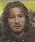
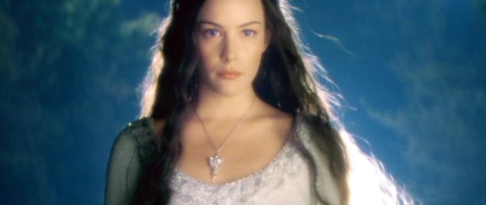
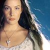
So, here is the picture I’ll be using in this tutorial. And if you have something against Arwen, sorry, I just find Arwen’s pictures to be more avatar-friendly than others!
Step 2: Opening Your Selected Picture
Open your favorite picture into the program you are using. You can do this either by saving the picture to your computer or simply making your browser half the size of the screen with your program behind it, and dragging the image into your program.
~ If you are the overachiever, and you’ve decided to work with a difficult picture, here are a few tips on how to make your image more eye-friendly.
– First, (for Photoshop people) go to Image–> Adjustments–> Hue/Saturation. This will help your reds become more red, blues, more blue, (etc.)
– For people without Photoshop, you may either have to look around for something like Hue/Saturation, or find Color Balance.
– Second, (for Photoshop people) go to Image–> Adjustments–> Brightness/Contrast. This will allow you to brighten or darken your image to make it look a bit better, as well as contrast the image, which brings out certain parts of the image more. (Note: Contrast is good to use, but not too much, or your image will look really messed up.)
– The last tip for a better looking image is un-blurring your image, which I will explain a bit later in the tutorial.
Step 3: Cropping Your Image
Now you are ready to crop your image. If you’re a Photoshop user, you can push C for the crop tool (or find the button that looks like a DNA strand, or a button in your palette with a box with a line through the middle). For other programmes, if you know where your crop tool is, great, but if not, you may have to do a search.
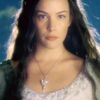
Set the Height and Width to whatever you would like to use. (For avatars here on CoE, 60×60 is the largest you can go; for MSNM or some Proboards forums, you can select 100×100 for the largest size, and AIM users should select 40×40.)
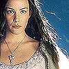
Now that you’ve selected the crop tool, fit a box around the part of the image you’d like to use. You may move that box around a bit to get it the way you would like it. When you are done, double click inside the box and you should have the correct size for your image. It should look basically like this:

Some tips on cropping images:
I find that not centering a person/object/place in the middle of the icon often looks better than actually centering them if you are planning on using text, or if you would just like a different look for your icon. If you do this, put the person/object on the opposite side to the one they are looking at, or sometimes, to whichever is their better side, like for Orcs, with only one good side period. You may also want to take note of the lighting of the picture. But if you are only planning on having just the person/object without any text in your avatar, then you can decide on which side you would like them to be on. Here is the centered picture to compare to the ‘sided’ picture.
Centered:
Side aligned:
Now you can decide which style you personally prefer.
At this point, if you are feeling like Ilúvatar for creating your avatar up to this point, you may be done here. But for me, my image is still way too blurry and it needs more work to be satisfying.
Step 4: Unblurring/Sharpening Your Image
This step is intended for those who liked their image, but it was too blurry for their taste, like mine.
For Photoshop users, go to Filter –> Sharpen –> Sharpen to sharpen your image.
You can sharpen your image as much as you want, but I would recommend stopping your fun as soon as your image is nice looking, or starts to show ‘blocks’, or pixels as they are called. If the pixels start to appear in large numbers, undo until you have few or no blocks/pixels in your image.
Here is my image so far, having used the sharpening tool twice:
And here it is after I’ve been having fun pressing the sharpen button three more times:
I really, really don’t recommend doing that, unless it looks totally awesome in your own eyes.
Step 5: Adding Text
This one is quite simple for all program users, just so long as they know how to add in text.
First off, figure out what you would like your avatar to say. For mine, I’m going to be really creative and type in Arwen, but type in what you would like your avatar to say, whether it be a single word or a quote/phrase. For multi-worded text avatars, I would recommend making two different layers for your text. This way, you can make one/several word(s) more noticeable than others and the other text layer less noticeable.
Next, fiddle with the size of your font, even though you’ll probably have to fix it again once you fix your font style. Next, go through your big, long font style list to find one that will ‘match’ your picture. For example, I would probably stick with a text with a more Elvish feel, because I am using Arwen. Using a font that would look more like the text on a stop sign would probably not ‘match’ my picture too well.
Sometimes, when I’m using a single word, or I have a favorite word out of the few I am using, I choose to make the first letter a different font than the rest of the word. For example, my first letter, A, is ElvenCommonTongue and rwen is DeannaScript. Sometimes making the first letter a different font makes it look a little better as well as changing that font to a different size (in my case, the A is font size 1200 and the rwen is font size 800. Your numbers will probably stay around 20-40ish if your picture is nice. My picture decided to make my life miserable, and had a low resolution. If you are using a calligraphy font, which connects the letters together, using different fonts may not work, as it might look a bit awkward.
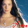
Here is my avatar with the fonts added:
Next, you’ll want to fiddle with the color a bit to make it match with the rest of your avatar. In my case, red looks very bad with this, so I would want to take a color out of the avatar picture itself, making that color darker or lighter to make it show up better, and using it for the font, like so:
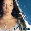
I took the blue from the blue background behind Arwen and made it darker so that it would show up in the picture better.
Also, if you add other effects to your text, like drop shadow, outer glow, or stroke, this may also help your text show up and look better.
Here is my final design for the avatar that I’ve used for this tutorial:
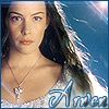
This is just a quickee icon, but if you really take your time you can make your icon look even better.
And here are two other icons that are made from the same original screen capture as the one shown in this tutorial, but with different effects and text designs:
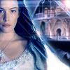
This one has more Lens Flares, along with the added Rivendell background. This is another reason why putting your object of attention to the side may be something to consider.
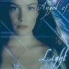
This avatar could be considered an oxymoron avatar because it says “light” but it is dark. I should have made the Arwen background lighter, but I didn’t because I didn’t experiment enough with the Brightness/Contrast. Regardless, this one was good because it shows the font size technique. The word ‘light’ is the one I wanted to show more emphasis on, so I made that word’s text bigger and more noticeable than ‘Angel of’.
This was just to show you how to make a basic avatar. Your program has hundreds of other things for you to do, so, don’t just stop here! Happy Avatar-Making!

3 Comments
I don’t have Photoshop but I read it anyway… the finished products are very nice! Some of the basic stuff mentioned, such as cropping and sharpening, can be done in programs like Windows Picture Manager too.
This is very helpful. Now does anyone know how I can get one of those moving avatars??
Never mind, I got one!!